Combination of colors in the interior of the house. Design lessons: how to choose a color combination for the interior
When thinking through the details of the design of the room, you should pay special attention to the color scheme. Successful combination flowers in the interior will lift your spirits when you return home. Eye-pleasing shades will allow you to relax after working day and enjoy your vacation.
The color scheme of the home furnishings creates a certain atmosphere in the house. Strict tones finishing materials in the office they set you up for work and help you concentrate. Pastel colors in the bedroom are conducive to relaxation. The combination of colors indicates the tastes and preferences of the owners. How to choose the right one harmonious combination?
Color wheel concept
You can choose the right combination of colors using the color wheel. The color wheel contains the colors of the light spectrum. It is based on the Itten color wheel. The artist Itten selected 12 colors and placed them in such a way that the contrasting tones were opposite each other.
The colors of the light spectrum can be obtained by combining three primary colors in equal proportions: red, blue and yellow. 
The result is secondary shades. When a primary color and an adjacent secondary color are mixed, a tertiary tone is formed. The resulting combinations (secondary and tertiary) together with the primary ones form a circle of 12 sectors. The gamut of the color wheel can be expanded to include countless shades and tones of primary colors. 
How to choose the right combination?
Selecting the right combinations:
- An analogue interior design color scheme contains a rich primary color and its shades. On color wheel they are located nearby;
- Colors in the interior that belong to the same temperature combine well. Blue, green and purple, as well as their shades, belong to the cold range. Red, brown and yellow along with undertones make up a warm palette. Cool and warm colors divide the circle in half. Black, gray and white are considered neutral tones. The table of color combinations in the interior will help you choose the optimal combination;
- You can use contrasting colors in your apartment design. On the color wheel they are located opposite each other. In this case, one shade should be bright and saturated, and the other (complementary) calmer. The combination of light green and purple looks beautiful in the interior of the apartment, the photo of which is presented below;
- Contrasting combinations can be made softer if, instead of a complementary color, you take its shades;
- The triadic scheme involves a combination of three shades located in the color wheel at an equal distance from each other;
- Any combination of colors in the interior can be complemented with neutral shades. They will help you place accents and focus attention on specific areas;
- Two different colors complement each of them with a common undertone. The table will help you choose a combination of colors in the interior. For example, blue and green will look harmonious when combined with turquoise;
- The rectangular scheme allows you to use 4 complementary colors in the interior of an apartment or house (2 cold and 2 warm). The square scheme contains 4 shades equidistant from each other;
- A small interior detail in bright or exotic colors looks very impressive against a neutral background. The monochrome interior will be decorated with a coral chandelier. A lilac armchair looks original and stylish in a room decorated in black and white.
 Designer recommendations for interior design
To create a color combination, it is better to use no more than 3 shades. The basic background should prevail on the finishing materials of the walls, ceiling and floor. Secondary tones are used for furnishing elements.
Up to 75% of coatings and finishing materials must have a base color. Secondary tones occupy 20% of the surfaces. The remaining 5% is used for color accents. Some designers recommend choosing colors according to the 60-30-10 scheme. 
It is better to use calmer tones as a base shade. Saturated, bright and contrasting shades should be present on furniture and accessories. If you want to choose 2 contrasting colors that do not combine with each other, you should complement them with a neutral option. It will ensure a smooth transition from one color to another and make the combination harmonious. A bright and rich base background is complemented by secondary calm or neutral shades. 
Will give the room relief accent in unusual place. You can paint the radiator or window sill in a bright color. A small black detail (lampshade or picture frame) will enhance the brightness of the interior colors and give the room solidity. It is correct to give preference to pure tones, avoiding dull and vague shades. 
Characteristics of main colors
Green is suitable for any room. It helps you relax and calm down. Recommended for finishing bedrooms and bathrooms.
Red is better for highlighting small details. Its abundance visually reduces the room and is irritating. Red is perfect for the dining room. It has the property of improving appetite. 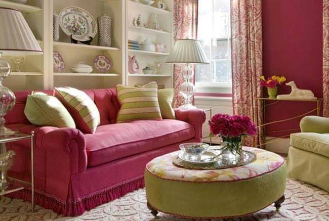
Cheerful warm yellow is often used to decorate children's rooms. It increases creativity and improves brain activity.
Blue has the ability to relieve tension. It has a calming and relaxing effect. Ideal for the bedroom. It is recommended to be used in non- large quantities. It will highlight the design style. The predominance of blue will make the room uncomfortable.
Royal purple will add solemnity to the living room. It can also be used for dining room. It is recommended to combine purple with pastel pink or light green. Its combination with blue and lilac looks good. Choosing a combination of purple and gold will make the living room luxurious. A large number of purple and its shades have a depressing effect on the psyche. 
Brown and its shades are the most popular when decorating interiors. This color scheme is associated with warmth, coziness, comfort and relaxation. Used in all rooms. However, the abundance of brown and its shades narrows the space.
Noble gray visually expands the space. It is an excellent backdrop for bright accessories. Gray and its shades must be diluted with other colors, otherwise the room will look dull and boring. It is not recommended to paint the ceiling gray: the room will look depressing. 
Black can only be used in small doses for contrast or separation of colors. Too much black can make a room feel gloomy.
Blue is not recommended for use in an office or for decorating rooms where schoolchildren study. It reduces performance and brain activity. It should not be used to paint the floor. The surface will feel unstable and slippery. It is recommended to decorate the dining room in blue tones for those who want to lose weight. 
Practical application of the color palette
The combination of colors in the interior will help change general form premises. By combining light and dark shades, you can visually lengthen, expand or narrow the room, as well as make it lighter and taller.
Light shades in the upper part of the room will visually make the ceilings higher. A bright contrasting color can help expand the room by painting narrow walls. Dark and rich shades will hide the unevenness of the walls. Perfect smooth surfaces light colors are emphasized. 
2 contrasting colors or a combination of a bright shade and its lighter tone can even out the corners. They are connected along a perfectly straight line drawn on one of the walls near the corner.
Increasing the space of a room is achieved by blurring the boundaries. This effect can be achieved if you paint the ceiling and the upper part of the walls (30-40 cm) in the same color. A room will appear larger if it is divided into two adjacent walls contrasting tones (saturated color and its light tone). The two remaining walls are covered with the same colors in the form of alternating stripes. 
Alternating stripes of bright colors will visually pull the room up and make it narrower.
A palette of warm shades is ideal for darkened and cold rooms. Selecting cool tones will make the room less bright and warm.
You need to combine colors in the interior, guided by your preferences, without being afraid to experiment. If you can’t find the desired combination, it is recommended to distract yourself for a while and walk around the house. You should imagine the future design in detail. You can paint large sheets of paper in the desired colors and attach them to the walls and furniture. This will help determine which color is best to choose for the kitchen or bedroom. 
Color combinations in the interior need to be carefully thought out before execution. repair work. If the decor doesn't live up to expectations, it will be much more difficult to change it.
Photo gallery
You can view 59 more in our gallery interesting options competent color combination in the interior.
Create a comfortable and harmonious interior You can do this not only by choosing the design of the space, but also by correctly combining colors in the interior. They are the ones who can influence the emotional and physical state of a person. Thanks to correctly selected color relationships, the house and its owner become an integral organism.

The color wheel is one of the important tools for creating the right color combinations in the interior. Issac Newton was the first to systematize the spectrum, dividing a white ray of light into red, orange, yellow, green, blue, indigo, and violet. This was the first color scheme.

Today, color wheels consist of one, two and three discs. They show what the relationships are between the colors arranged in a circle. All the colors of the spectrum are located on the axis of the circle - primary, secondary and tertiary. For example, Itten's color wheel:

Primary colors
All colors, with the exception of white, come from primary colors. Blue, yellow and red (the triangle in the center of the circle) are the primary tones. Combinations of these three colors make up the secondary colors.
Secondary colors
The next six colors of the circle are obtained by mixing two primary (primary) colors. For example, purple is obtained by mixing red and blue, and green is obtained by mixing blue and yellow, but orange is a combination of red and yellow.
Tertiary colors
If you mix one primary color with a secondary color, you get a tertiary tone. Total - 12 colors. You can also create a tertiary color by mixing a base tone with a large amount of another base tone to create a tertiary color. For example, one part blue with two parts red will create a red-violet color.
Advice
:
It is important which colors are located next to the tone that interests you, as well as those that lie opposite the color you have chosen. For example, yellow goes well with the opposite violet, and light green is harmonious with the color of bright pink or fuchsia. Next to yellow there are two colors with which you can create harmonious chromatic combinations.
Shades and halftones
Shades are obtained from the main color. For example, blue has light blue and dark blue shades.
. Tone is the result of adding white and black (gray) to the base color. Tone, unlike pure pigment, makes the color softer and more pleasing to the eye.
How to mix colors
The perception of color depends on the distance of the color spot from the human eye. For example, as the distance increases, green appears more bluish, yellow begins to turn orange, and orange begins to turn red.
. The saturation of the color tone of the interior depends on the illumination of the interior. Light levels range from light to dark on a gray scale. Floors and walls can reflect light, so light-colored surfaces in a room enhance brightness, while dark-colored surfaces dampen tones, making them dull.

Advice :
.The quality of brightness or depth of color shade depends on the light and shadow in the interior. Therefore, adding a gray tone to the design of a room can significantly soften the effects of different color combinations.
. If you need different shades of blue, dilute the color combination of the interior with a black shade. And then the cold tones of blue will sparkle with tonal gradations.
. To change the shade of any paint in the interior, add white. It will dilute and extinguish unnecessary brightness in the color combination.
Scale for determining color proportions
Using this scale, you can determine the proportions of tones and halftones. A safe ratio for color combinations in the interior is 70/20/10.
70% - tertiary shades in a neutral base
20% - secondary colors
10% - primary color

Advice
:
Use moderation when mixing colors! Try not to mix more than a few shades. Two or three colors in a neutral base are considered the safest.
Various color schemes
Color schemes and triads are a set of interior color combinations that work together to create a visually appealing palette. The color combinations given in color schemes can be considered classic. Of course, the possible color combinations are endless. But experienced designers feel which of the schemes to apply in practice.
Classic triad
A combination of three colors that are equidistant from each other. The use of such contrasting combinations will create harmonious palette. You should choose one main color and use the other two as accents.

Analog triad
Combinations of 2 to 5 colors located nearby make up similar or related combinations. For example, yellow-orange, yellow, yellow-green, green, blue- green color.

Complementary combinations
A complementary color (also known as a contrast color) that is opposite the second color on the Itten color wheel. The combination of these colors creates a bright and exciting effect, especially at maximum saturation.

Rectangular diagram
A four-color combination is a scheme consisting of one primary color and two additional colors. The company includes one more additional tone to highlight accents. For example, blue-green, blue-violet, orange-red, orange-yellow.

Square pattern
A combination of four colors located at equal distances from each other. Dynamic colors are different in tone and, at the same time, complement each other. For example: purple, orange-red, yellow, blue-green.

Rules for using a color scheme
Color combinations in the interior are conventionally divided into warm and cold. Thanks to them, you can visually enlarge or reduce the room. It all depends on the chosen basic tone. This is why the selection of complementary colors is so important. They are located opposite each other on the color wheel. Each tone brings out the richness of the other. When using complementary colors, one color should be soft and weak in tone, while the other should be more dominant. For example, an intense dark purple should be paired with light yellow shades.

Decorate adjacent rooms in similar colors. Plan your color scheme based on how visible each room is from the other. Look for related colors. For example, related tones are located next to each other on the color wheel. These colors produce less contrasting effects than complementary colors. For example, the dark tones of a blue-green room combined with the light blue colors of the adjacent room can give the feeling of floating in a blue lagoon.

Choose a base color that you like best and use as many shades of it as you can think of. For example, they give maximum effect when adding related or complementary colors. Contrary to popular belief, monochrome is not a black and white duo or one single color. True monochrome combinations often consist of one main tone and several adjacent tones. For example, green color may look quite independent and self-sufficient. It fills the entire interior space, but this is only at first glance. If you look closely, you will see tones of apple and grass, young greenery and swampy mud in shades of khaki, juicy lime and pistachio, transparent candy in yellow-green tints and olives. All these shades are successfully emphasized by white, gray, as well as interspersed tones in metal and wood colors. That's basically how you get monochrome!

Advice :
Choose one favorite color that will become the main color in the interior. And then add to it objects and accessories in shades and halftones of the same color, and dilute this complex monochrome palette with things in neutral shades. But only a little bit - in order to shade the main palette.

First decide where you are going to use the colors in the room. General rule when decorating is to use three different meanings in a combination of colors: light, medium and dark. Walls and floors are usually decorated in light colors, depending on the effect you are trying to create. The floors should be slightly darker than the walls to avoid a floating effect. Window sashes and large pieces of furniture are often created in a medium value to tie in light walls and floors. Dark colors should be used as an accent color in the interior.

Color temperature
Some color combinations in the interior are warm, others are cold. Psychologists say that the color of a room can affect a person’s mood and well-being and evoke an emotional response in him. Some color combinations in the interior create a general feeling of calm and physical satisfaction, while others cause internal tension and discomfort. Colors can be as ideal partner, and the enemy with whom you will have to unconsciously fight.

Warm and cozy colors
for the interior are located on right side color circle. They radiate positive energy and the power to unite people.
Red
radiates energy, strength and passion. Restaurants and bars often use this color of strong energies because it increases appetite and promotes socializing. And it is a common choice for kitchens and dining rooms in the home. However, red should be avoided in the bedroom.

Orange
This color is considered exciting and powerful. Its presence in the kitchen and dining room is known to increase appetite and relax. Psychologists advise using orange in moderation. Orange is less aggressive than red. It creates warmth and a feeling of joy. However, it is recommended to use it only as an accent color.

Yellow
Sunny shades of yellow are associated with happiness and warmth, but rich and bright tones can increase frustration and anger. Typically, yellow is an uplifting color. When yellow is overused, it can become distracting and overwhelming. Don't let this color in large quantities in the children's room, because children are known to cry often. But using it in the kitchen in tandem with orange will cause positive emotions and even euphoria. Yellow has different effects depending on how and in what quantities it is used.

Cool and soothing colors
Cool and soothing colors located on the left side of the color wheel provide a sense of calm and a sense of trust:
. Green. It is a calming and refreshing color that reminds us of young greenery, grass, pistachios and juicy limes. It easily fits into any room. Green conveys a feeling of renewal and growth. It is used in rest rooms, such as bedrooms. It is not uncommon to see different shades of green in the kitchen. And, of course, in children’s rooms, because children love everything natural so much, especially colors associated with nature.

Blue
If you're trying to create a calm, spa-like environment, consider blue. Like green, it is a calming color and is also good for bedroom decor. Iridescent and bright shades of blue are used in offices to increase productivity. Light blue can make a room feel bright and refreshing, while deep blue creates a sense of self-worth.

Violet
This color has long been associated with royalty and wealth. It contains the calmness of blue and the energy of red. Combined with some active tones, it stimulates creativity and vitality. However, in large quantities and in tandem with red, it becomes dangerous to health, causing euphoria.

Advice :
Worth mentioning Brown color, as the most commonly found in interiors. Brown consists of several colors, which are based on warm and cool tones: red, yellow and blue. Dark brown or wenge is obtained by adding black to this triad. Brown represents restraint, reliability and modesty. This is one of the most powerful tranquilizer colors, it belongs to the warm colors of the earth, and therefore has become the basis of a psychologically calming palette.

Brown fits perfectly into color combinations in the interior, for example, with gold, as well as tones similar to it in shades, for example, with yellow. If we ignore the interior, many people associate brown and red colors with warts. Follow some principles so that they don't bother you.

The appearance of purple in a brown tones suggests subtle idealized relationships and feelings. Such combinations are appropriate in living rooms and dining rooms, where an environment that brings pleasure to the body is needed: delicious food, luxury items, beautiful accessories and furniture.

Color combinations in different rooms
Before choosing a color for the kitchen, living room, bedroom or nursery, you should remember that white plays an important role in the palette.
White
- this is the basis of the spectrum. It really helps freshen up the space and makes it feel clean. Therefore, this color is always appropriate in pastel colors, combinations of various colors of a neutral palette in the interior. But even warm and hot shades from Mexican interiors allow white color, as a complementary and accentuating blue and light blue color combinations.
Pastel color combinations
Pastel colors are the result of adding a large amount white in various combinations of complementary colors. They create a comfortable, spacious feeling in any room.

Neutral color palette
Shades of white, beige, dark brown, gray and black form the basis of neutral color combinations. The neutral palette is the lightest and airiest for one obvious reason: all these neutral shades mix with most colors on the wheel. They can be stylish and dramatic. For example, black and white, as neutral tones, create a wonderful palette of complementary shades for different base tones.

Advice
:
If you choose neutral color combinations in the interior, use bright accessories to accent the walls and make interesting room. When you're ready for a change, simply change the color of your accessories.
Bedroom
The bedroom interior is usually created in soothing colors. However, through different color combinations using complementary tones, designers have opened up a lot of possibilities. For example, combinations of gray and beige colors in the bedroom interior they create the lightest and most weightless intimate spaces in which you can relax from the hustle and bustle of the day.
For example, the bedrooms are magnificent, in which pearl-pearl shades predominate, combined with a beige tone.

A bright bedroom is created when you choose one intense and colorful primary color, for example, fuchsia pink. The selected color on the color wheel is combined with light yellow. They complement each other, but by introducing white, or a similar color to yellow, khaki, you will get a more balanced interior.

Bedroom in gray colors represents a “refuge” for a person seeking solitude and detachment from the bustle of the outside world. A bedroom in gray tones is indifferent to the bright and conflicting outside world.

Red shades between warm related yellow, peach and orange tones, which are complemented by combinations of blue, turquoise and light blue. The impression of contrast is hidden thanks to gray shades and white color, which actively participates in the overall palette.

A bedroom with color combinations, among which turquoise occupies a dominant position, looks optimistic. In such an interior, it is important to create a complex color scheme consisting of several additional tones, for example, khaki, blue, light blue. As well as tones that are located opposite blue-green on the color wheel, namely beige, light yellow or even peach, but you need to feel the measure. Because with the introduction of warm, bright shades, the room will become like a guest room for communication.

Fashionable Scandinavian style is reflected in the bedrooms. The main tones in color combinations are brown and purple, which require the support of calm shades of gray, lilac and grass. Natural colors are combined in such a bedroom with airy shades of frosty air.

Bedroom in blue tones tends towards peace and perfection. Nothing seems to distract you from relaxation. With a minimum amount of furniture it looks extravagant. If you add islands of white and cream to blue, this will soften the pressure of blue. In rooms serving as a place of relaxation, splashes of optimistic pink are preferred. Bedroom in lilac tones

Raspberry color in the bedroom is for extravagant people. And the partner yellow and neutral black in shiny nickel colors help to enhance the extravagance of purple.

Living room
A room in gray-blue combinations is very calm, seasoned and requires the introduction of neutral tones - black and white, which dilute the harsh atmosphere of two related tones.
Blue is almost impossible to get boring, it is fresh, serene and promotes friendly relations between people. But dark blue combinations evoke nostalgia for the past. The situation will be corrected by small splashes of pink and purple, turquoise and white. Introducing yellow will create a joyful atmosphere in the living room.

Color combinations in neutral tones are the most beneficial theme in the interior. After all, in such rooms you can relax with your family and gather friends. You never get tired of combinations in neutral colors. The main range is wenge and adjacent colors: beige and gray - all colors of the earthy palette. And yet, two or three bright inclusions would not hurt from the tones located opposite these combinations - orange and soft green, two color partners.

A living room in a green palette evokes a pleasant feeling, reminiscent of young spring grass and the first summer apples. Fresh, juicy and tender green tone in the interior should be supported by related shades. And if you succeed, your living room will become your family’s favorite place to stay and popular among guests. And believe me, no one will want to leave you for a long time.

Two colors - pink and azure - are simply meant to be together! Additional beige, white and gray hold back the onslaught of bright fuchsia. All together they form a classic triad on the color wheel, complementing each other.

A bright room requires a combination of self-sufficient brightness tones, the basis of which is red-pink and dark gray. Tertiary shades located on the opposite side of pink and red will be no less juicy.

The ocher tonality of the living room accepts brick and orange, as well as additional tones of gray, khaki and light blue. Orange can be introduced into the design in accessories.

Bathroom
A Tiffany or Sea Breeze bathroom is a pleasant color scheme made up of related tones, the primary of which is blue.

Pink is not typical for a wet room, but if you have a pink bath, then the entire room should be dressed in pastel shades of pink, diluted with a gray tone.

Green combined with related tones and white gives an incredibly refreshing feeling.

Children's
A children's room in beige tones must be combined with pink and light green flowers in delicate shades. White color will not hurt to create complete harmony.

A room in lilac tones is usually made for girls. Lilac is a tertiary color formed by two tones: secondary pink and primary blue. Lilac brings a touch of playfulness and carefree.

Kitchen
The peach dining room seems bright only at first glance; if you look closely, you can see a combination of several primary, secondary and tertiary colors in the interior. Primary yellow found partners among tertiary peach (yellow + orange), secondary light orange and beige.

Olive is a complex secondary color formed by two primary colors: yellow and green. It is part of the spectrum of green color, which carries freshness, youth and love of life. Yellow, participating in combinations with green, softens this tandem. The resulting yellow-green with a large percentage of yellow symbolizes peace and contemplation.

Conclusion
The perception of color is purely individual. Therefore, when composing the palette of your interior, do not restrain yourself by the generally accepted framework, focus on your own worldview and desire to do something special. Don't forget that only your favorite colors will bring joy. A color wheel will help you create color combinations in the interior using the primary color as a basis.
Guys, we put our soul into the site. Thank you for that
that you are discovering this beauty. Thanks for the inspiration and goosebumps.
Join us on Facebook And In contact with
Scheme No. 1. Complementary combination
Complementary, or complementary, contrasting colors are colors that are located on opposite sides of the Itten color wheel. Their combination looks very lively and energetic, especially with maximum color saturation.
Scheme No. 2. Triad - a combination of 3 colors
A combination of 3 colors lying at the same distance from each other. Provides high contrast while maintaining harmony. This composition looks quite lively even when using pale and desaturated colors.
Scheme No. 3. Similar combination
A combination of 2 to 5 colors located next to each other on the color wheel (ideally 2–3 colors). Impression: calm, inviting. An example of a combination of similar muted colors: yellow-orange, yellow, yellow-green, green, blue-green.
Scheme No. 4. Separate-complementary combination
A variant of a complementary color combination, but instead of the opposite color, neighboring colors are used. A combination of the main color and two additional ones. This scheme looks almost as contrasting, but not so intense. If you are not sure that you can use complementary combinations correctly, use separate-complementary ones.
Scheme No. 5. Tetrad - combination of 4 colors
A color scheme where one color is the main color, two are complementary, and another one highlights the accents. Example: blue-green, blue-violet, red-orange, yellow-orange.
Scheme No. 6. Square
Combinations of individual colors
- White: goes with everything. The best combination with blue, red and black.
- Beige: with blue, brown, emerald, black, red, white.
- Grey: with fuchsia, red, purple, pink, blue.
- Pink: with brown, white, mint green, olive, gray, turquoise, baby blue.
- Fuchsia (deep pink): with grey, tan, lime, mint green, brown.
- Red: with yellow, white, brown, green, blue and black.
- Tomato red: blue, mint green, sandy, creamy white, gray.
- Cherry red: azure, gray, light orange, sand, pale yellow, beige.
- Raspberry red: white, black, damask rose color.
- Brown: bright blue, cream, pink, fawn, green, beige.
- Light brown: pale yellow, creamy white, blue, green, purple, red.
- Dark Brown: Lemon Yellow, Blue, Mint Green, Purple Pink, Lime.
- Tan: pink, dark brown, blue, green, purple.
- Orange: blue, blue, lilac, violet, white, black.
- Light orange: gray, brown, olive.
- Dark orange: pale yellow, olive, brown, cherry.
- Yellow: blue, lilac, light blue, violet, gray, black.
- Lemon yellow: cherry red, brown, blue, gray.
- Pale yellow: fuchsia, grey, brown, shades of red, tan, blue, purple.
- Golden yellow: gray, brown, azure, red, black.
- Olive: orange, light brown, brown.
- Green: golden brown, orange, light green, yellow, brown, gray, cream, black, creamy white.
- Salad color: brown, tan, fawn, gray, dark blue, red, gray.
- Turquoise: fuchsia, cherry red, yellow, brown, cream, dark purple.
- Electric blue is beautiful when paired with golden yellow, brown, light brown, gray or silver.
- Blue: red, gray, brown, orange, pink, white, yellow.
- Dark blue: light purple, light blue, yellowish green, brown, gray, pale yellow, orange, green, red, white.
- Lilac: orange, pink, dark purple, olive, gray, yellow, white.
- Dark Purple: Golden Brown, Pale Yellow, Grey, Turquoise, Mint Green, Light Orange.
- Black is universal, elegant, looks in all combinations, best with orange, pink, light green, white, red, lilac or yellow.
Most of the information about the world around us is made up of visual impressions, and color plays a huge role in the perception of visual images. The ability to notice the slightest nuances has greatly contributed to the survival and development of the human species. Almost all people have a subconscious reaction to color: soft colors of nature calm, while unnaturally bright ones cause anxiety. Given this fact, to create a comfortable interior, it is important to understand the principles of the influence of both individual colors and their combinations on the psyche.
The impact of color in the interior on a person
Physicists say that colors don't actually exist - they're just different wavelengths of light that the brain interprets in one way or another. It is quite difficult to believe in this thesis, because we can absolutely accurately determine the shade of any object in the material world, and it remains unchanged regardless of the place or time of stay. Be that as it may, every person feels the influence of his surroundings. color palette. The mechanism of this effect is not fully understood, but some common features psychologists still know.
For convenience, colors are divided into categories according to their main characteristics: dark and light; pastel and rich; bright and muted. Depending on the temperature, warm, cold and neutral colors are distinguished. Black, white and gray are called achromatic, all others are called chromatic. The latter include the three main colors: red, green and blue, as well as all the options resulting from mixing them with each other or with a black and white palette. The result is amazing - a person is able to recognize up to ten million shades.

Considering the psychological influence of color, it is worth noting that we are talking primarily about pure tones. Any admixture changes the quality of perception. For example, soft coral will have a calming effect, while rich scarlet will excite nervous system.
In general, warm colors such as red, yellow and orange are considered tonic: they speed up the heartbeat, improve appetite, and increase attention. Cool shades of blue, cyan, and green relax, lower blood pressure and somewhat slow down the reaction. The body subconsciously perceives an abundance of light (white, pastel colors) as a sunny day, automatically increasing energy levels, while gray, black, dark blue and gloomy purple set a person up for the upcoming sleep.
In order not to make a mistake when choosing colors for the interior, it is necessary to take into account their inherent optical effects. For example, if you place two objects of the same size next to each other different colors, then the brighter one will always appear larger. Dark, muted tones visually reduce volume, while light and glossy tones increase volume. Using these features, you can adjust the width of the walls, the height of the ceiling, place accents and zone the space.


How to choose “your color”?
Throughout life, each person develops his own attitude towards the color palette. Choices can be influenced by personality traits, individual experiences, mental associations, mood, and even health conditions.
When decorating the interior, you should pay close attention to the sensations that arise when interacting with certain colors. As an example, it is recommended to remember the design of the most comfortable places for you: your favorite restaurant, friends’ apartment, grandma’s house, finally. You can borrow a palette from nature - it could be the sea coast, the edge of a forest, blooming garden or mountain landscape.
Can be a wonderful source of inspiration beautiful pictures from the Internet. Find an image you like and try to mentally repeat it in the interior - transfer the background to the walls and ceiling, reflect bright details in furniture elements, textiles and decor. It is advisable to observe the proportions of colors inherent in the picture, so that the same harmony is obtained in the end. It’s not at all necessary to choose a design photo - take anything: a bouquet of tulips in a jug, a rustic landscape, shells on the seashore or a chocolate cream dessert. This method allows you to independently create very natural and pleasing compositions.

Table of color combinations in the interior
Combining shades is a whole science. It is necessary to understand the basic rules, if followed, colors placed together will complement and emphasize each other, enhancing the sense of style. The best color combinations in the interior are obtained using the following methods:
1) Monochrome - shades of the same color of different depth and saturation are used. Using red as an example, it could be a pastel pink background with brick and burgundy accents. In the blue palette, it is possible to combine light blue, turquoise and ultramarine. In green tones - the colors of lime, olives and moss.
2) Related shades. Similar tones are located next to each other, in one quarter of the color wheel. Examples - blue, purple, pink; yellow, orange, red; blue, green, yellow.
3) Contrasting colors. Here, harmony is built on opposites - in the color wheel, the shades are strictly opposite each other, and their dissimilarity creates a dynamic and noticeable pair.
4) Related-contrasting combination. In this case, the shades are combined due to the admixture of some third color in them. So, for example, in light green and orange there is a yellow that unites them, and this triangle looks great together.
White
Matches with colors: all pastel and pure bright colors, black, gray, gold; with warm ones it is better to use cream, with cold ones - snow-white.
Does not match colors: no (combines with everyone).
Color effect: creates a feeling of cleanliness, spaciousness and daylight. A glossy, all-white room can feel overly sterile and reminiscent of a laboratory.
Suitable for: interior of bathroom, bedroom, living room.


Grey
Matches with colors: yellow, red, orange, green, purple, pink, blue, black, white.
Does not match colors: gold, brown.
Color effect: psychologically neutral, does not cause emotions in itself. Associated with shade, rainy weather, winter. Monochrome gray interior may cause depression.
Suitable for: studio apartments, bedrooms, kitchens, home office.


Black
Matches with colors: white, gray, gold, red, green, orange, purple.
Does not match colors: all pastel, blurry, shaded; with yellow - danger sign (road signs, radiation and high voltage warning signs).
Color effect: status, suitable for creating an atmosphere of luxury. Reminiscent of deep night, visually reduces space.
Suitable for: studio apartments, large halls.


Red
Matches with colors: black, white, gray, gold, brown.
Does not match colors: purple, pastel shades; looks extravagant with blue and green.
Color effect: excites the nervous system, increases activity. May cause aggression and anxiety in children.
Suitable for: interior of kitchen, living room.


Orange
Matches with colors: brown, green, purple, pink, blue.
Does not match colors: no (combines with everyone).
Color effect: friendly, warming color. Reminds me of summer, sun and oranges. Increases sociability, energy, and creates a good mood. Does not promote relaxation and is contraindicated in hot climates.
Suitable for: kitchen, children's room, living room with windows facing north.


Yellow
Matches with colors: brown, orange, light green, white, gray, purple.
Does not match colors: no (combines with everyone).
Color effect: warm, open, joyful. Sunny yellow softly illuminates the room, gives cheerfulness, promotes concentration, and increases curiosity. Prolonged exposure to a saturated shade can be overwhelming.
Suitable for: kitchen, children's room, office.


Green
Matches with colors: brown, gray, white, black, yellow, pink.
Does not match colors: red.
Color effect: the most natural color, harmonious and calming. Refreshes, gives rest to the eyes, restores strength. Pale shades of green in large quantities can be depressing.
Suitable for: interior of a bathroom, children's room.


Pink
Matches with colors: white, beige, gray, pastel blue.
Does not match colors: red.
Color effect: Feminine pink creates a soft and serene atmosphere and eliminates depressive thoughts. This color can irritate active and overly tense people.
Suitable for: living room, bathroom, nursery, bedroom.


What could be more important than harmony? After all, translated from ancient Greek language, harmony is coherence, proportionality and order. Therefore, all this must be present in interior design. Great value The right combination of colors and their shades plays a role in the design. Every experienced designer knows that the color scheme is the most important factor in shaping a person’s perception of the world, so the main task is to choose the right color palette. After all, each color is individual, therefore, working with it should have individual approach. In this article you will find everything that concerns color harmony, and most importantly, you will learn what rules must be followed when combining different shades.
Stylish interior in the right shades
Color, as you know, plays a huge role in decorating rooms, color scheme and creating a single color plot. Therefore, by changing the color scheme of, for example, your room, it will acquire a completely different appearance. The room may change beyond recognition. For example, space can visually increase or, conversely, decrease. Therefore, it is extremely important to be able to correctly combine the palette to create any interior.
In order for you to feel comfortable in the space you create, it is imperative to choose a color scheme that reflects the entire essence of your character. Therefore, the choice of color palette should be approached carefully and thoroughly, and also take into account a number of features that, to one degree or another, influence a person. Only by following all the rules you are guaranteed to be satisfied with the result.


First, you should decide on your desires: do you want to create a festive mood or, on the contrary, choose calmer, warmer colors, smooth lines for peace and relaxation. After the decision has been made, you should proceed to the most important thing - choosing and the right combination color range.


Let's talk in more detail about color
It's no secret that all colors and their shades are divided into warm and cold. Orange is considered the warmest color. The coldest is blue. This is evidenced by the research conducted in special conditions an experiment that found that people who were in an orange room complained of cold much less often than those who were in a blue room.
Successfully combining orange with others is not so easy. All this is because it does not have cold shades, as a result of which it is suitable only for a narrow range of colors. Orange goes best with yellow, cream and peach.


The color blue is usually associated with coolness and water. All shades of blue are more conducive to rest and relaxation than shades of yellow. After all, warm colors, on the contrary, are conducive to activity and fun. And therefore, many may think that warm colors do not go well with cold ones. But this is absolutely not true. It is on this combination that many design ideas are built.
Blue- an indicator of reliability, strength and confidence. Having a series in my head fresh ideas, creating a light and relaxed atmosphere using this color will not be difficult.


How to combine different colors without disturbing the overall harmony
If you want to visually expand the room and make it more comfortable, you need to combine cold shades with warm ones. Meanwhile, we want to feel differently in different rooms. For example, in the living area you want comfort and tranquility, in the dining room or kitchen you want to create an environment that has a beneficial effect on pleasant communication and a good appetite.
In the bedroom, we want to relax and take a break from the everyday hustle and bustle. If your goal is to get a noble interior that will be the personification of tranquility, pay attention to the gray color and.


The combination of gray and white in the bedroom is a classic of the genre

Let's talk a little more about the bedroom. In order to get a better night's sleep, you need to relax well and fall asleep quickly. To do this, experts advise using shades of blue and other cool colors. But on the other hand, it is also believed that it is the red color that gives people more strength and energizes them.
From here we can draw only one conclusion: the most important thing is that you like the chosen color, so that it does not hurt your eyes or burden the decor, otherwise you simply will not be able to stay in the room for a long time.


If you find it difficult to choose suitable shade, you can resort to the services of a designer who does this intuitively, or use special tables where the optimal combination of colors in the interior is selected. Taking into account your desires and fashion trends, using this table you can choose the ideal option for yourself.
Let's consider several approaches to choosing color solutions
- The first approach is to select the tone of the desired color. That is, the color can be more or less saturated. Don’t be upset if the desired color doesn’t seem so expressive to you, and the room seems faded. Don't rush to add brightness to the colors. It’s better to complement the room with contrasting details.
- The second approach is to select several colors that would fit perfectly together. As a result, it turns out perfect, harmonious design. The most important thing in this approach is a sense of proportion and healthy sense.
If such abilities are not yet as well developed as those of designers, then you can use this picture, which clearly shows the optimal combination of color palette:

The most mysterious organ human body- this is the eye. After all, he is able to distinguish up to one and a half million shades. Some people do not attach due importance to colors and their shades. But this is their delusion. All this happens inside us, and our brain reacts to every color.
Each color leaves its mark on our well-being, behavior, emotional state. Therefore, you should be more careful about some unfavorable colors. Let's talk about them.
- For example, the color red most often contributes to the development of anxiety and nervous tension;
- Be careful with purple and black. They can visually make your room smaller;
- Brown color can put you into a state of melancholy or depression;
- Blue color, as mentioned above, is associated with cold. Therefore, it will be very difficult to create comfort in a room where only blue shades predominate;
- Gray color will never give joy and fun, but only the opposite - a sad mood and despondency.


But don’t despair, because there are many other colors that can be safely used in the interior. Colors that give a feeling of happiness, joy, create comfort and coziness. Here are some of them:
With the help of beige and warm shades of yellow, you can easily create coziness and comfort in your room. Decorate the interior using these tones and you will create a calm and romantic atmosphere in the interior.


Green and yellow also promote relaxation, uplifting, and calmness. Turquoise color is ideal for the bathroom, as it is the personification of freshness and cleanliness.


Blue color is very calming and promotes have a good rest, sometimes even makes you sleepy. Therefore, most often in bedrooms, this color is used. But in offices and where vigor and freshness are needed, it is not recommended to use blue.


Orange and yellow colors They give extraordinary energy, good mood, encourage people to communicate and give a feeling of warmth, which is not unimportant in cool rooms. In addition, yellowness has a positive effect on the mental activity of the brain, causing it to work more productively.
The first associations with yellow are summer, sun and beach. And such sensations cannot but cause a storm of positive emotions. Therefore, using this color combination you will always be in a summer mood.


The best color to go with yellow is blue

White color is generally considered neutral. But if there is too much of it, unpleasant sensations may appear that irritate the eye. However, if an experienced designer gets down to business, then you don’t have to worry about anything.
Gray color promotes performance. It is good to use both at home and in offices and work areas. If you use black correctly, for example, add some accents, you can end up with a very elegant design;

Colors in the interior are of key importance, try to do it so that you feel truly comfortable in it

Red color can lift your spirits, give you vigor and emotional excitement, while pink is conducive to calm, tenderness and relaxation.
If you are afraid to overdo it with pink and do not want it to become the prevailing shade in your interior, use upholstered furniture, light and transparent curtains, beautiful decorative pillows and other decorative elements in rainbow colors.


From everything we have read, we can conclude that each color is individual and good in its own way. Therefore, in order to create the desired coziness and comfort in the room, it is necessary that you like the chosen colors and do not cause the slightest discomfort.
For the rest, our tips on how to get the optimal combination of popular shades will help you.


. Fill in the missing letters and explain the spelling of the words.")


- Turkey stewed in a slow cooker: spicy, with vegetables, in sour cream, cream and walnuts
- Types of speech: description, narration and reasoning
- Girls and women almost always associate white shoes with a wedding dress, although the white color of shoes has long been no longer required. A...
- New
- Why you shouldn't cry in front of the mirror
- Martyrs Tatiana. Moscow Church of St. Martyrs Tatiana Temple of the Martyr Tatiana at Moscow State University schedule
- Milotici: return of the Russian village Moravov Alexander Viktorovich
- Making sounds for children Lessons on making sounds for children
- Recommendations: what to grease the pies to make them rosy and appetizing
- Actors Spiderman Aunt May Aunt May in Spiderman
- What does a lizard tattoo mean?
- Deciphering the natal chart of the house
- What does mulberry help with?
- Photo report “Birthday of Samuil Yakovlevich Marshak in the group”
- Breathing at high pressure Breathing correctly at high pressure
- Bryansk State University named after
- Tasks to test spelling and punctuation literacy
- Application...burning, grow...sti, to...sleep, m...roll, warm...up, sk...roll,...
- The Forex economic calendar is a reference book for every trader, regardless of trading experience and level of professionalism, and especially...
- Interesting signs about spiders